Delivering
Outstanding
Web Solutions
Transparent Pricing. No Costly Surprises
Lets Get Started with our Pre-defined Packages with the Guarantee of Cheapest Price In the Market
Need a Customized Website or Mobile Apps?
Share your requirements and get a 30% flat discount on Custom Packages.
Services We Offer
#1 App Development Company, awarded for its Best Performing Apps Delivered.
Visiweb, being the Top Rated App Development Company in India, USA & UK, with our 8 years+ experience in Apps industry, we have delivered 500+ websites & apps globalzly.
We have Delivered 500+ Apps Globally
Our App Professionals are Known for Fast Performing Apps, Pixel Perfect Design & 100% Error Free Code
8 years+ Exp.
Designers & Developers
"100+10"%
Money Back Guarentee
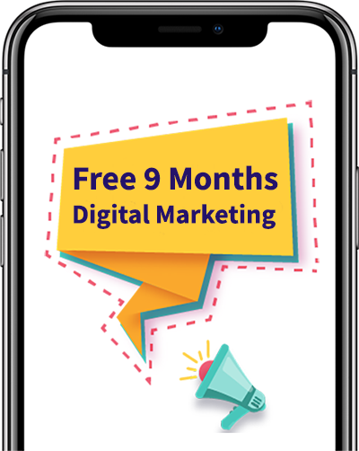
9 Months
Free Promotion
Free 2.5 Yrs
Maintenance & Support
Know our True Potential By Our Clients
Customer Centeric Websites & Apps that
![]() Bring Revolution in Your Business Ratings
Bring Revolution in Your Business Ratings![]()







Benefits We Offer
Being a Trusted Website & App Development Firm in India & USA, We Believe in Delivering Out-of-the-box Solutions
Free Speed Optimization
Fastest Loading Time
Free Security Optimization
Hack Proof Code
Best Coding Standards
Clean & Commented Coding
Live Project Tracking
Hrs spent & Daily Progress

Complete Source Code
Copyrights & IPR

Low Add-ons Cost
For Extra Features
Experts in Every Domain
With Their Years of Experience, Our App Developers Build Websites & Apps that Get Millons of Daily Visitors.
Schedule a Meeting

Call or Whatsapp
Sales and general inquiries
+91 8383 033 985
Assistance Hours:
Monday – Saturday
9 am to 7 pm IST

Mail or Skype
Write Us
sales@visiwebsolutions.com
Our Skype Id
live: c07006306445de9e


 For Sales Inquiry